Edit text without changing the background
For anyone replacing words that sit on a photo, a painted sign, a fabric print or a gradient, where retouching the background by hand is the hard part. This guide shows how to edit text without changing the background, what is meant to stay as it was, and which areas beside the letters deserve a close look.
Or drop an image here. PNG, JPG or WebP, up to 14 MiB.
Your image stays on this device until you sign in.
Sign in with Google to upload. Your first Standard edit is free and includes a watermark.
Examples
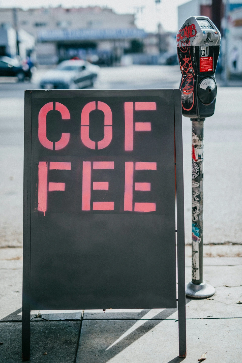
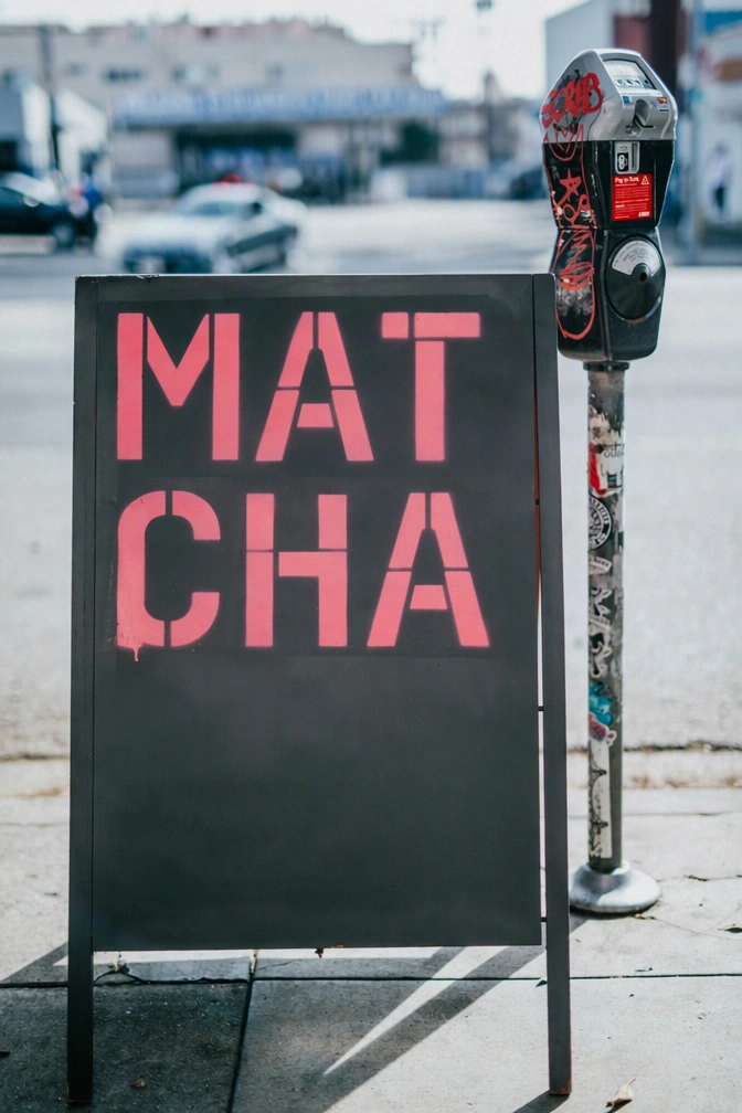
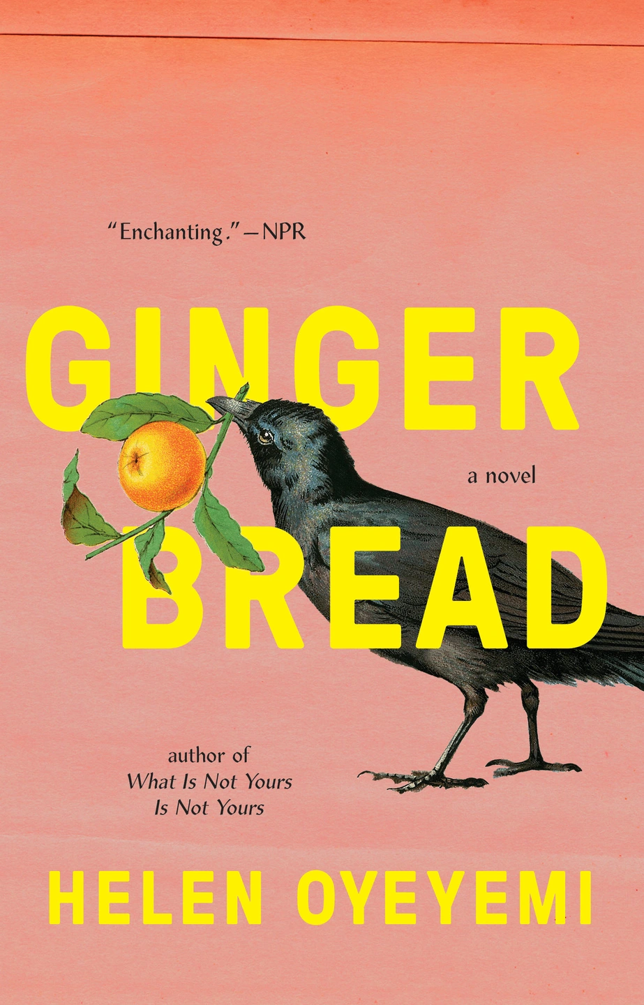
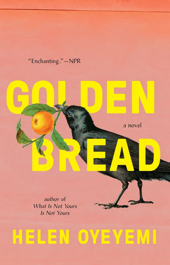
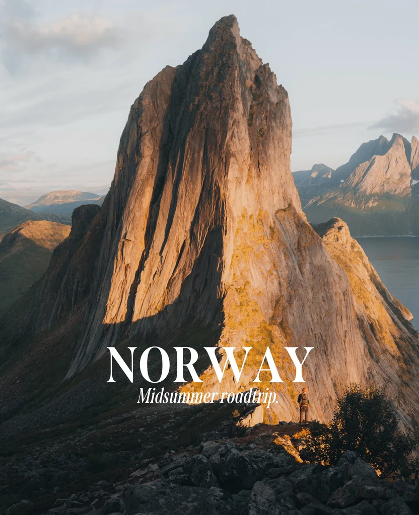
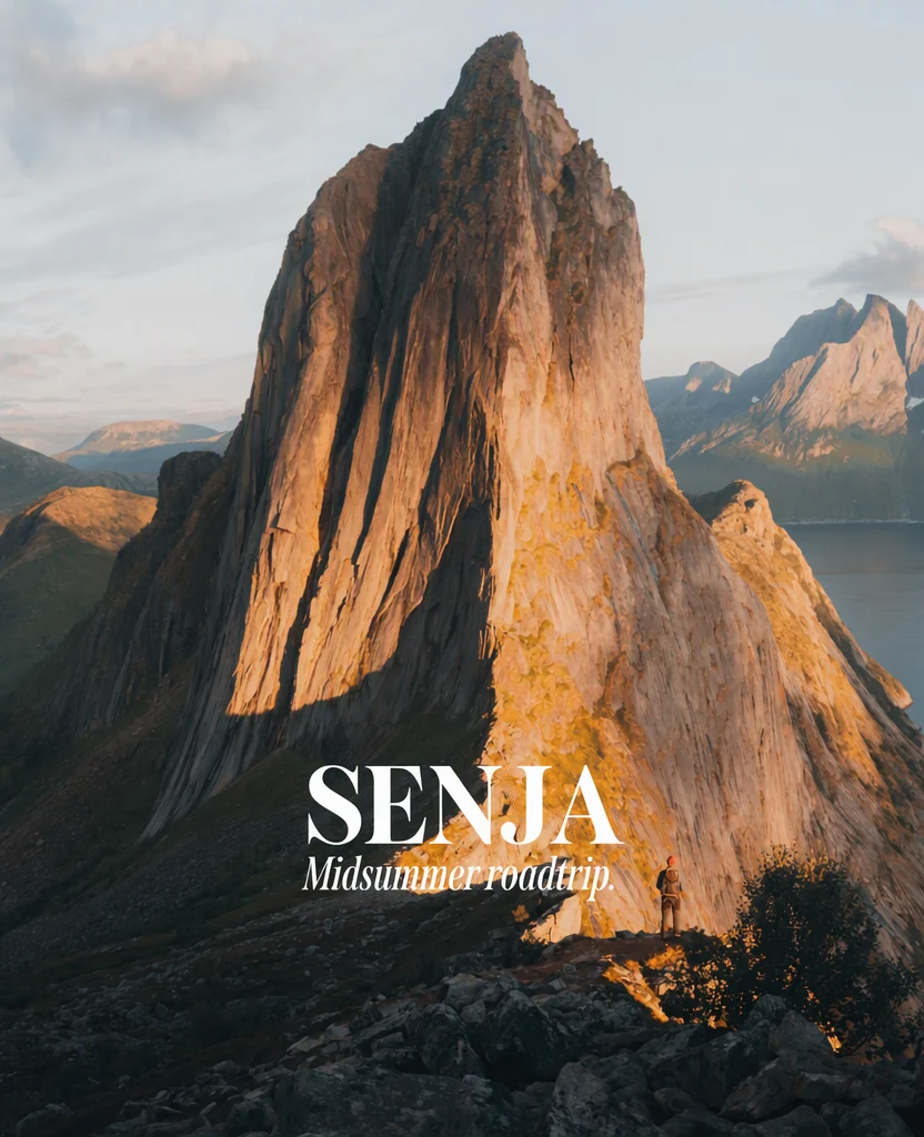
How it works
Upload the whole image
Upload the original PNG, JPG or WebP (up to 14 MiB) without cropping tightly around the words. The picture around the letters guides how any uncovered background is filled.
Change only the lines that need it
Edit the Replacement field for each line that should read differently and leave the rest as they are. Every line you change is another area where nearby details can shift.
Correct words hidden behind objects
If a hand, a plant or a product covers part of a word, detection may read only the visible letters. Type the full word in the Original entry so the right text is replaced.
Choose the quality for the background
Standard (1 credit) suits plain or smoothly shaded backgrounds. When the letters sit on fine detail, such as foliage, fabric weave or a busy street, choose High quality (2 credits). Paid plans can also edit in 2K or 4K: Standard uses 2 or 3 credits, and High quality 5 or 7.
Check around the letters
After you select Apply changes, move the comparison slider slowly across the text and its surroundings. Look at edges, textures and any lines behind the words before you download the PNG.
What should stay the same, and where to look
When you edit text without changing the background, the goal is that only the words change. The photo or texture, objects in front of the letters, other text and the rest of the layout should come back as they were. The place to look first is the area right around the letters, because details close to the text can change along with it. Typical spots to check:
- Texture inside and between the letters, such as paint, grain, fabric weave or paper.
- Lines that pass behind the words, such as a horizon, a shelf edge, a seam or a window frame.
- Reflections on glass or glossy surfaces that cross the text.
- Gradients and soft light, where a patch can look flat or slightly different in color.
- Other text nearby, which should read exactly as before.
When something overlaps the words
Text in photos is often partly covered: a cup in front of a menu board, a hand holding a sign, leaves across a painted wall. Objects in front of the letters should stay in front of the new ones, with the same shape and edges. After the edit, look closely at fine edges such as fingers, hair, leaves and thin branches where they cross the text, since those are details close to the letters.
A longer replacement may reach places the old word did not, including behind the object. Check that the new letters pass behind it and never appear on top of it. If the overlap looks wrong, try wording closer in length to the old word, or High quality.
Photos, textures and gradients
Lettering that belongs to the surface, such as stenciled paint, chalk, embroidery or a print on fabric, should still look like part of that surface. The image guides texture as well as letter shape, so painted letters should come back painted and worn letters should stay worn. If the new words look printed on top of the surface instead, try High quality.
Text over a photo or a gradient needs a different check. If the replacement is shorter than the old words, background that was hidden behind letters becomes visible, and its surroundings guide how it is filled. Results vary more on very detailed backgrounds, so on a busy scene, check that uncovered area most closely.
Checking with the comparison slider
The comparison slider shows the original and the edited version in the same frame, which makes changes outside the words easier to notice. Move it slowly and stop with the dividing line directly over the text, then directly beside it. Anything other than the letters that shifts or changes color as the line passes should be checked closely. After that, open the PNG you downloaded and look at it at full size, where small changes in texture are easier to see.
If something near the text changed that should not have, two things can help: High quality, and a smaller change. Edit fewer lines in one pass, or choose wording that covers about the same area as the old words, so that less background is uncovered.
Frequently asked questions
Can I change the words on a sign in a photo I took?
Yes. Signs are often photographed at an angle, in uneven light or with weathered paint, and the new letters should follow all three. Check that the replacement leans with the sign, is lit like the rest of it, and shows the same wear. If it looks flat or too clean, choose High quality for the next attempt, since it is designed for finer detail.
Can I move the text to a different spot?
No. The new words take the place of the original line, and the editor has no tool for moving or resizing text. If the words need to sit somewhere else, remove them by leaving their Replacement blank, download the cleaned image, and add the new text in a design app where you can position it freely.
What happens to a shadow or glow behind the old letters?
A shadow or glow belongs to the lettering, so it should follow the new words instead of keeping the shape of the old ones. Look at the background where the old shadow fell: a faint outline of the previous letters there means that area was not fully rebuilt. Try High quality, then compare that spot again.
What if the background is a repeating pattern?
Choose High quality and check the pattern closely. Tiles, stripes, brickwork and printed fabric make any break in the repeat easy to see, so follow the lines of the pattern across the area where the old letters were and check that they continue at the same spacing. If the repeat still breaks, keeping the new wording about as long as the old leaves less of the pattern to rebuild.
Try it on your own image
Or drop an image here. PNG, JPG or WebP, up to 14 MiB.
Your image stays on this device until you sign in.
Sign in with Google to upload. Your first Standard edit is free and includes a watermark.