Translate App Store screenshots for each localization
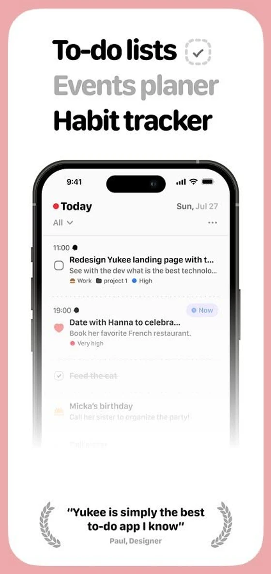
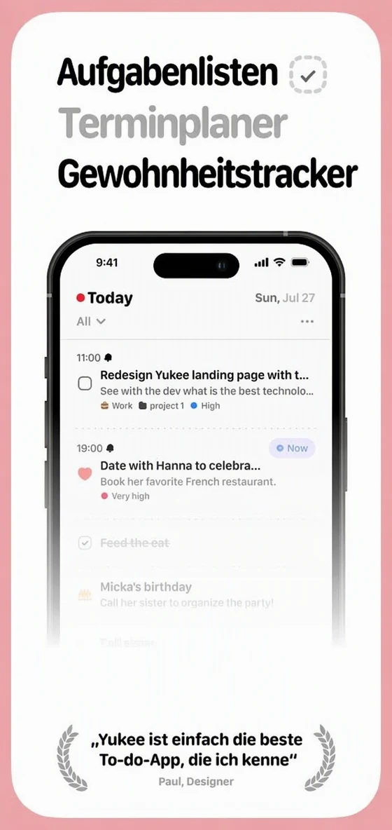
App developers and marketers who publish in several languages often prepare a separate screenshot set for each App Store and Google Play localization. Here is how to translate App Store screenshots, keep the device frames and design, and make sure every screenshot stays true to the app people will download.
Or drop an image here. PNG, JPG or WebP, up to 14 MiB.
Your image stays on this device until you sign in.
Sign in with Google to upload. Your first Standard edit is free and includes a watermark.
Examples
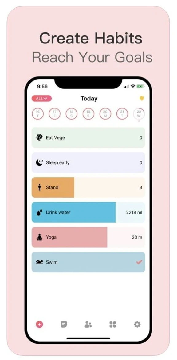
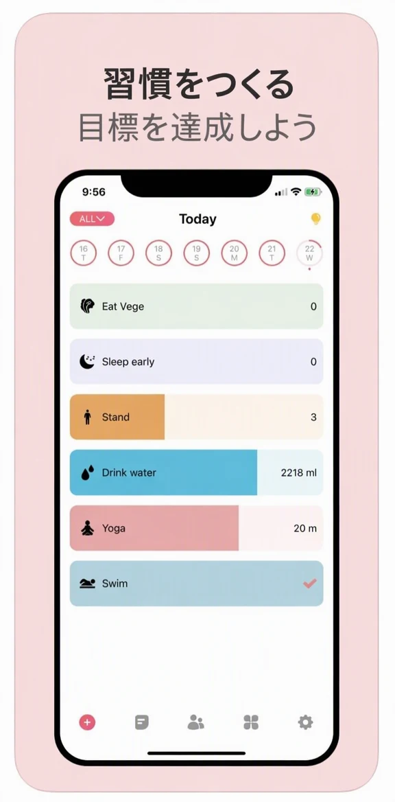
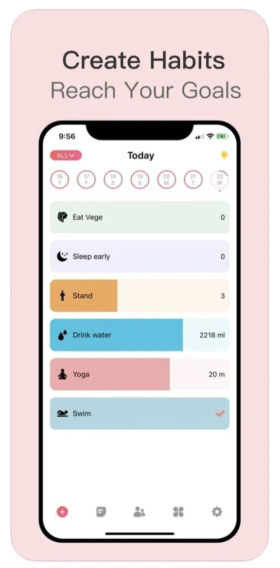
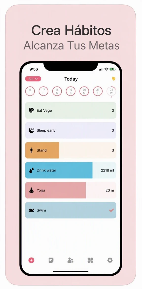
How it works
Work through the set in order
Start with your primary-language set and follow the order the store shows it, so captions stay consistent from one screenshot to the next. Upload the exported files, not screenshots of your store page.
Choose the localization's language
Select the language of the store localization you are preparing. Have your approved feature names ready to check the result against, and the app's own text in that language if the app is localized.
Choose what to translate
All detected text is translated by default, interface text included. If the app is not localized in that language, switch off Translate all text and leave only the caption lines ticked, so the interface stays as it is.
Translate and check the frame
Select Translate image, then compare before and after. Look closely at the caption edges, the device frame and the background, and try High quality if the caption lettering looks soft or misshapen.
Review the set before uploading
Download each PNG, check its pixel dimensions against the store's current requirements, and read the whole set in order with a fluent speaker before you upload it to that localization.
Captions and interface text need different care
Store screenshots often combine two kinds of text: a marketing caption above or below the device, and the interface inside the device frame. The caption is yours to adapt. The interface is different, because screenshots should reflect the app people actually download.
If your app is localized, the interface in each screenshot should match the strings the app really shows in that language. The most reliable source is a new capture from the app running in that language. If you translate the interface text in the image instead, compare every label in the result with your app's localized text, and use the Edit text tool to correct any label until it matches word for word.
If the app is not available in a language yet, translate the caption only: switch off Translate all text and leave just the caption lines ticked, so the interface stays as those users will see it. A translated caption above an English interface describes the app accurately. A translated interface that the app does not have would mislead the people who download it.
Fitting translated captions
Captions are short, sit in a fixed area and are often seen at a small size, in search results or on a phone screen. A translation can run longer than the English, and a long caption may wrap onto an extra line or look smaller than the captions beside it.
When you translate App Store screenshots, treat each caption as a message to adapt rather than a sentence to translate word for word. The AI fits a long translation into the caption area with a smaller size or a line break, so compare each caption with the ones beside it. If one runs long or sounds stiff, ask your fluent reviewer for a shorter phrase that sounds natural to local users and type it in with the Edit text tool. Keep one pattern across the set, for example every caption starting with a verb.
Before you upload a locale's set
Look at each finished set the way someone browsing the store would: in order, at phone size, without the English version beside it. Then go through this list.
- Every caption has been read by a fluent speaker next to its screenshot.
- Interface labels, menu names and button text match the app in that language.
- Prices, dates and units shown inside the app match what users in that market will see.
- The device frame, status bar and background look unchanged in the comparison.
- Each PNG meets the store's current size requirements for its device type.
- File names include the locale and the position, so the set uploads in the right order.
Frequently asked questions
Is it better to change the caption in my original design file?
Sometimes. If you have the editable design file and time to update it, changing the caption there gives you full control over type and spacing. EditText.ai helps when you only have the exported images, or when you want a first version of a locale to review before you spend design time on it. The interface rules and the review steps are the same either way.
What if a small interface label comes out wrong?
Try High quality first, since small text such as tab names or settings labels can go undetected or turn out hard to read. If the label is still wrong, take a new capture from the app running in that language. That gives you the real interface text, which is what the screenshot should show anyway.
Which screenshots should I translate first?
Start with the first few in the set, because those are the ones people see before they scroll, and with the languages where you expect the most new users. You can translate the rest later. When you do, check that they use the same caption wording and feature names as the first ones, so the set still reads as one.
How do I keep feature names consistent across languages?
Make a short glossary for each language before you start: every feature name, menu name and tagline, with the approved translation beside it. Check each translated screenshot against it, and when a different word appears, replace it with the glossary term using the Edit text tool. Share the same glossary with whoever writes your store description and your in-app text.
Try it on your own image
Or drop an image here. PNG, JPG or WebP, up to 14 MiB.
Your image stays on this device until you sign in.
Sign in with Google to upload. Your first Standard edit is free and includes a watermark.