Edit text in an image with the same font
For designers, marketers and small business owners who need new words on a finished graphic but have no layered file and do not know which typeface it uses. To edit text in an image with the same font style, you type only the new words; the lettering already in the image guides how they are drawn.
Or drop an image here. PNG, JPG or WebP, up to 14 MiB.
Your image stays on this device until you sign in.
Sign in with Google to upload. Your first Standard edit is free and includes a watermark.
Examples
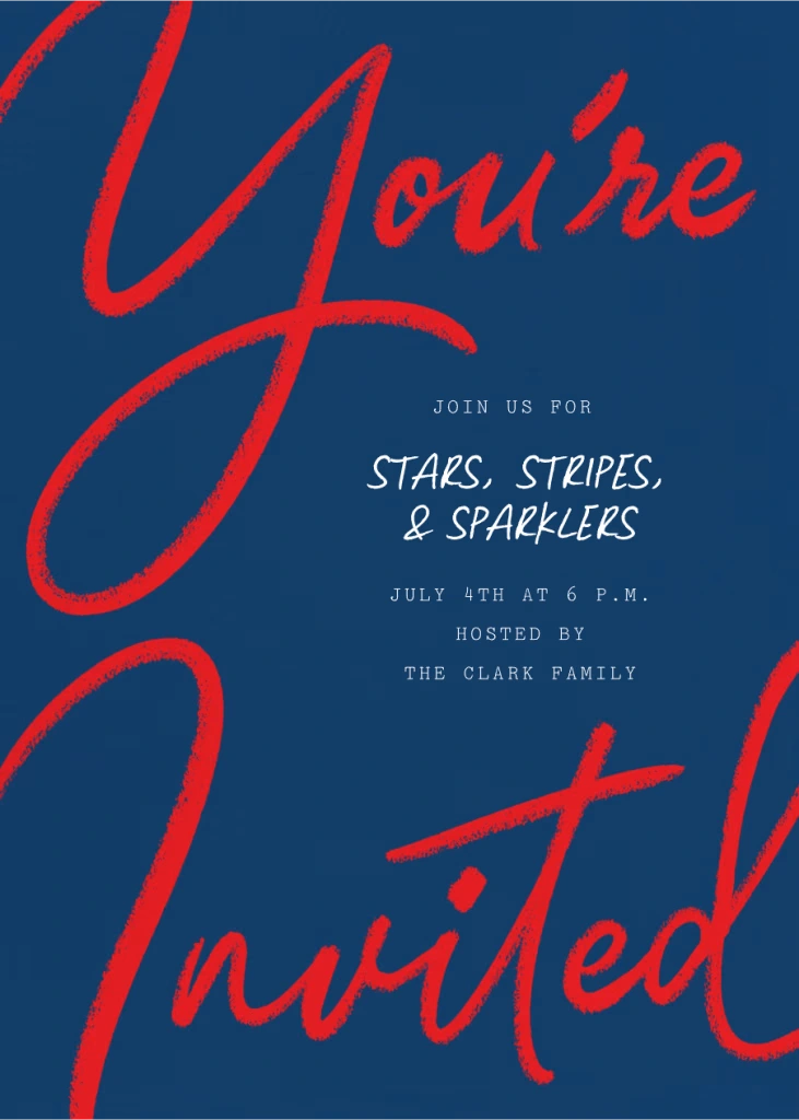
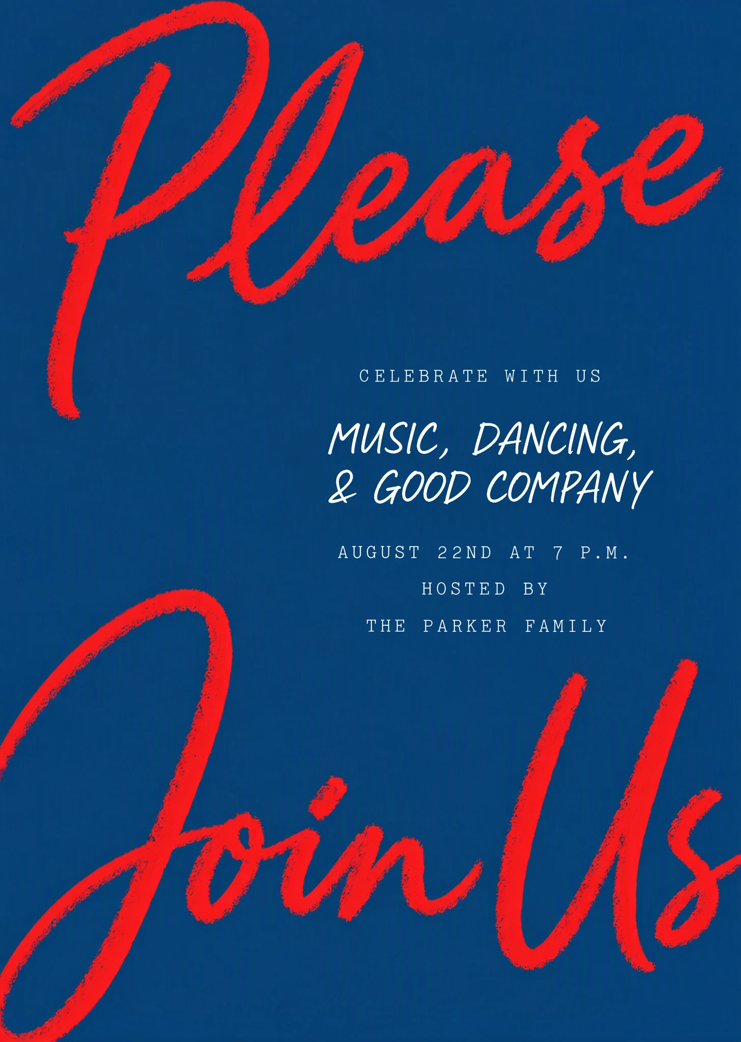
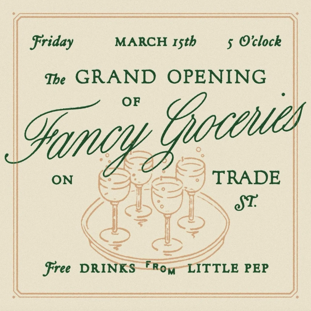
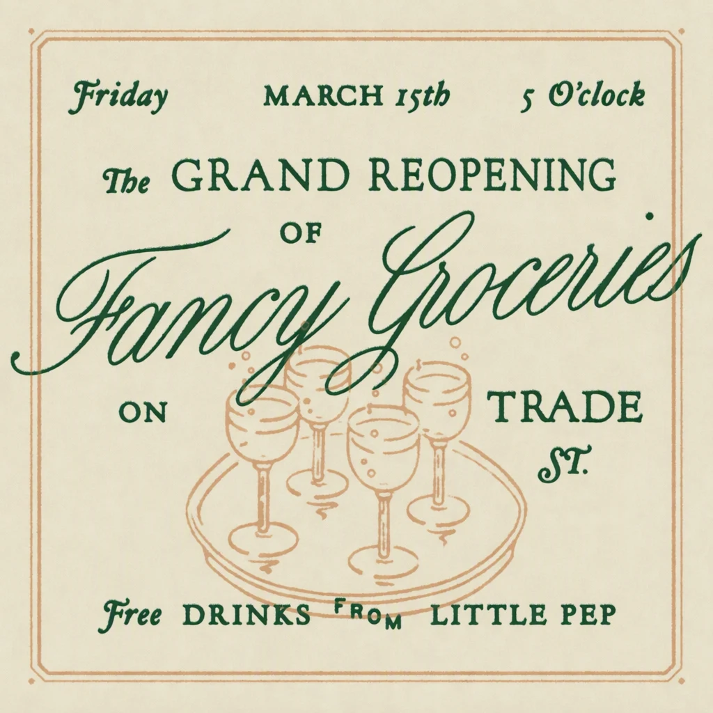
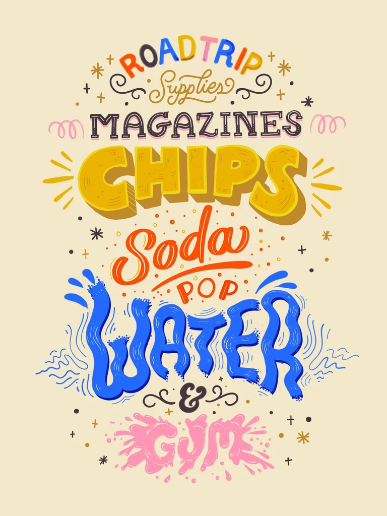
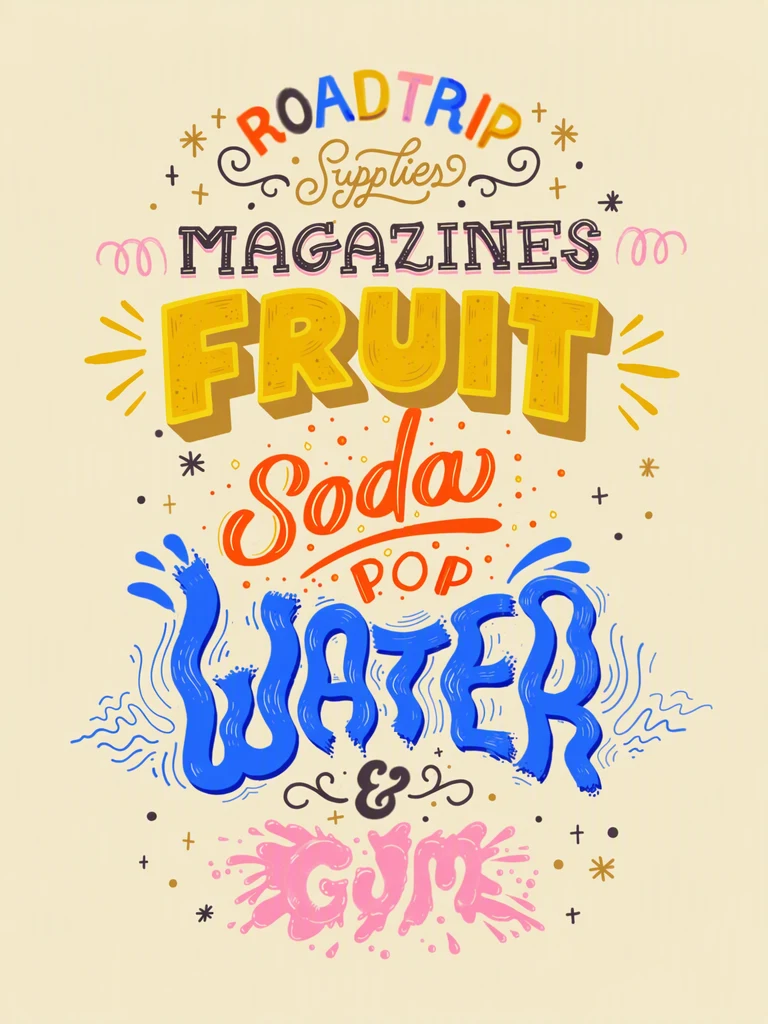
How it works
Upload the flattened file
Use the sharpest copy you have. A flattened PNG, JPG or WebP export up to 14 MiB is enough: there is no layered file or font to load.
Confirm each Original entry
Each detected line appears as an Original entry. Check that it matches the image letter for letter, because script and decorative letters can be misread. Correct it, or use Add text for a missed line.
Type the new words in matching case
In the Replacement field, type the words exactly as they should read. If the original is all capitals, type capitals, and include any accents and punctuation. Leave lines you are keeping as they are.
Pick the quality for the lettering
Script, brush and hand-drawn letters, and lettering with fine detail, are what High quality (2 credits) is for. For plain lettering, Standard (1 credit) is the faster option. With a paid plan you can also choose 2K or 4K, where Standard uses 2 or 3 credits and High quality 5 or 7. Then select Apply changes.
Compare the letter shapes
Drag the comparison slider across each changed line and compare stroke weight, slant, spacing and any outline or shadow. Then download the PNG and check it at full size.
What the new letters take from the original
There is no font to identify, install or select. Instead, the lettering in your image is the reference for the new words: their shape, size, color and texture. That turns editing text in an image with the same font into a comparison rather than a search. After each edit, compare every changed line with the original on these points:
- Weight: a thin or light original should stay thin, not turn bold.
- Width and slant: condensed, extended or italic letters should keep their proportions.
- Letter details: serifs, rounded stroke ends and the joins between script letters.
- Case: all capitals, small capitals or mixed case, as in the original line.
- Color and fill: flat color, gradients and printed or painted textures.
When the new wording is longer or shorter
Each entry is one line of the design, and the replacement goes where that line was. Where you can, keep the replacement close in length to the original. A much longer phrase may come out narrower, smaller or more tightly spaced than the lines around it, because it takes the place of a shorter line. A much shorter one leaves part of the old line empty, and that space is filled based on the surrounding image.
Check alignment as well as spacing. A centered title should still look centered, and a left-aligned line should still start where the lines above and below it start. If a long replacement looks cramped, try a shorter word with the same meaning, or run the edit in High quality.
Outlines, shadows, swashes and accents
Effects are part of the lettering the image shows, so an outline, a drop shadow, a gradient fill or a worn print texture guides the new letters as well. Because these are fine details, they are the first things to compare. If an effect comes out weaker than in the original, or is missing, try High quality, which is meant for complex lettering and finer detail.
Script lettering needs one more check. Loops, tails and swashes belong to the old word, so when the letters change, those strokes should go with them. Look below and beside the new word for a leftover curve from a letter that is no longer there. An underline, a small ornament or anything else touching the letters can change with them.
If the new words need accented letters, such as é, ñ or ü, type them in the Replacement field exactly as they should appear, then check every mark in the result. Small marks above or below a letter are easy to miss on a quick look.
Getting a closer match
Start from the original export, not a screenshot of it or a copy that has been compressed several times. Sharp edges give the editor clearer letter shapes to follow, which matters most for thin strokes and small serifs.
If a result is close but not right, change one thing at a time. Check that the Original entry matches the image exactly, switch to High quality, or make the change smaller by editing fewer lines or choosing a shorter replacement. Changing one thing per attempt shows you which change helped.
Frequently asked questions
Can it match hand lettering or a custom typeface?
It treats them like any other text. There is no font file to match against, so hand lettering, brush script and custom display type all use the image itself as the guide for the new letters. This kind of lettering is also where results vary most, so choose High quality, keep the wording close to the original length, and compare loops, joins and stroke ends closely.
Can I change the font, color or size instead of the words?
No. EditText.ai is built to change what the text says, not how it looks. There is no font menu and no color or size setting, because the image guides all three. If you want the text in a different typeface or color, edit the original design file in a design app, or recreate the line there.
Can I change lines in different lettering styles in one edit?
Yes. Every detected line has its own entry, so a design that mixes a script headline, a bold subheading and small plain details can be changed in one edit, for the same credits as changing a single line. Each new line follows the lettering of the line it replaces. The quality you choose applies to the whole edit, so pick High quality if any of the styles is script or finely detailed.
What if the text I want to change is very small?
The process is the same, with two extra checks. First, make sure the line was detected at all; if it is missing, use Add text and type it in yourself. Second, check the downloaded PNG at full size, because small differences in thin strokes and serifs may not show in a reduced preview. High quality is meant for finer detail like this.
Try it on your own image
Or drop an image here. PNG, JPG or WebP, up to 14 MiB.
Your image stays on this device until you sign in.
Sign in with Google to upload. Your first Standard edit is free and includes a watermark.